We have been big fans and regular supporters of Keymaster Games ever since their Kickstarter Campy Creatures hit the scene. The gameplay looked simple, fun, and just the right amout of surprise strategy to make it unique! But the thing that got our attention right away were the AMAZING illustrations that brought the game to life. The Keymaster crew teamed up with Josh Emrich of Emrich Office for their cult-inspired monster card game, and his blend of texture, vibrant colors, and characterization really make his work stand above the rest.
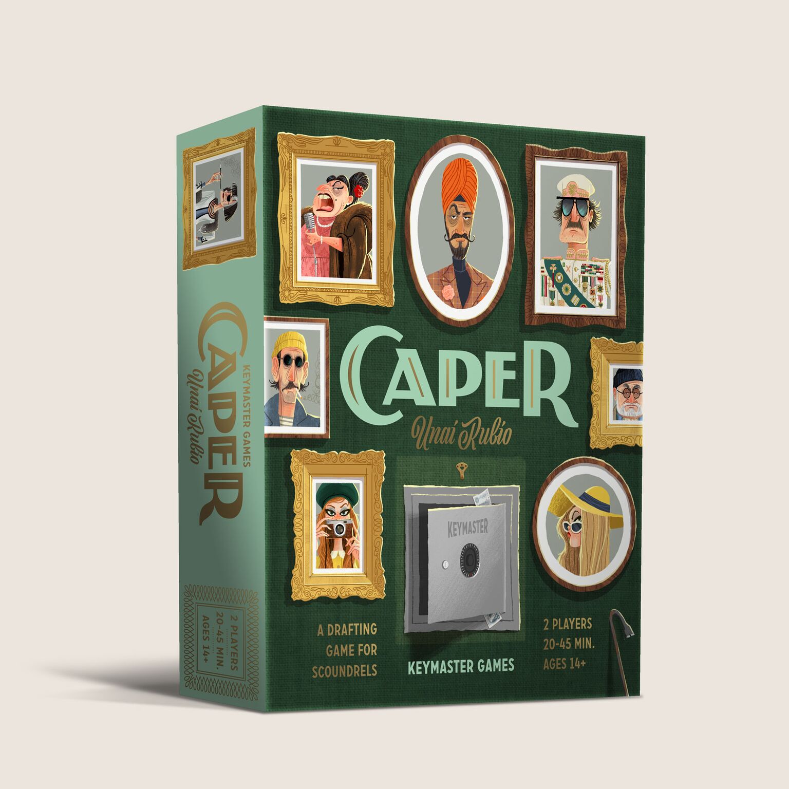
Well the team is at it again! Keymaster and Emrich are releasing their new heist-inspired card game Caper!
We sat down with Josh to hear more about the game and get a behind-the-scenes look at what it takes to bring one of these beautiful worlds to life.
How does redesigning an existing game change your approach?
Caper was originally published as “It’s Mine” in Spain and had already received Dice Tower’s seal of excellence. Although the mechanics of the game were sound, Keymaster Games and I wanted to push the art and theme to be more unique and interesting, especially for a North American audience. We had a lot of freedom to do what we wanted. It’s really nice to work on a game that already exists because it’s easier to get a feel for what works and what can be improved.
What elements did you choose to keep from the original game? What did you add?
The mechanics in Caper heavily rely on color coding and iconography, so we kept that structure, but tried to enhance it with a bit more sophistication and storytelling. Overall, we really wanted Caper to push beyond simple tropes to become it’s own unique world inhabited by memorable characters.
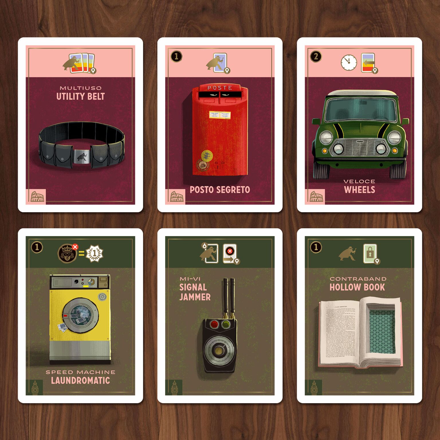
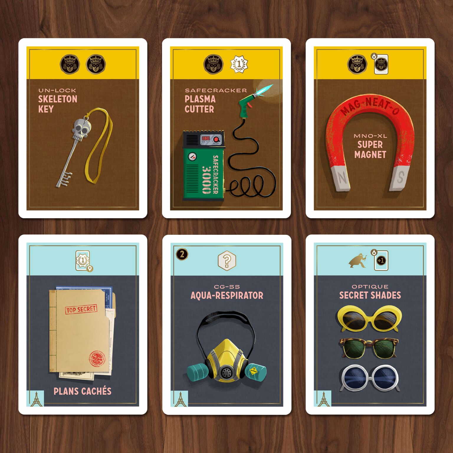
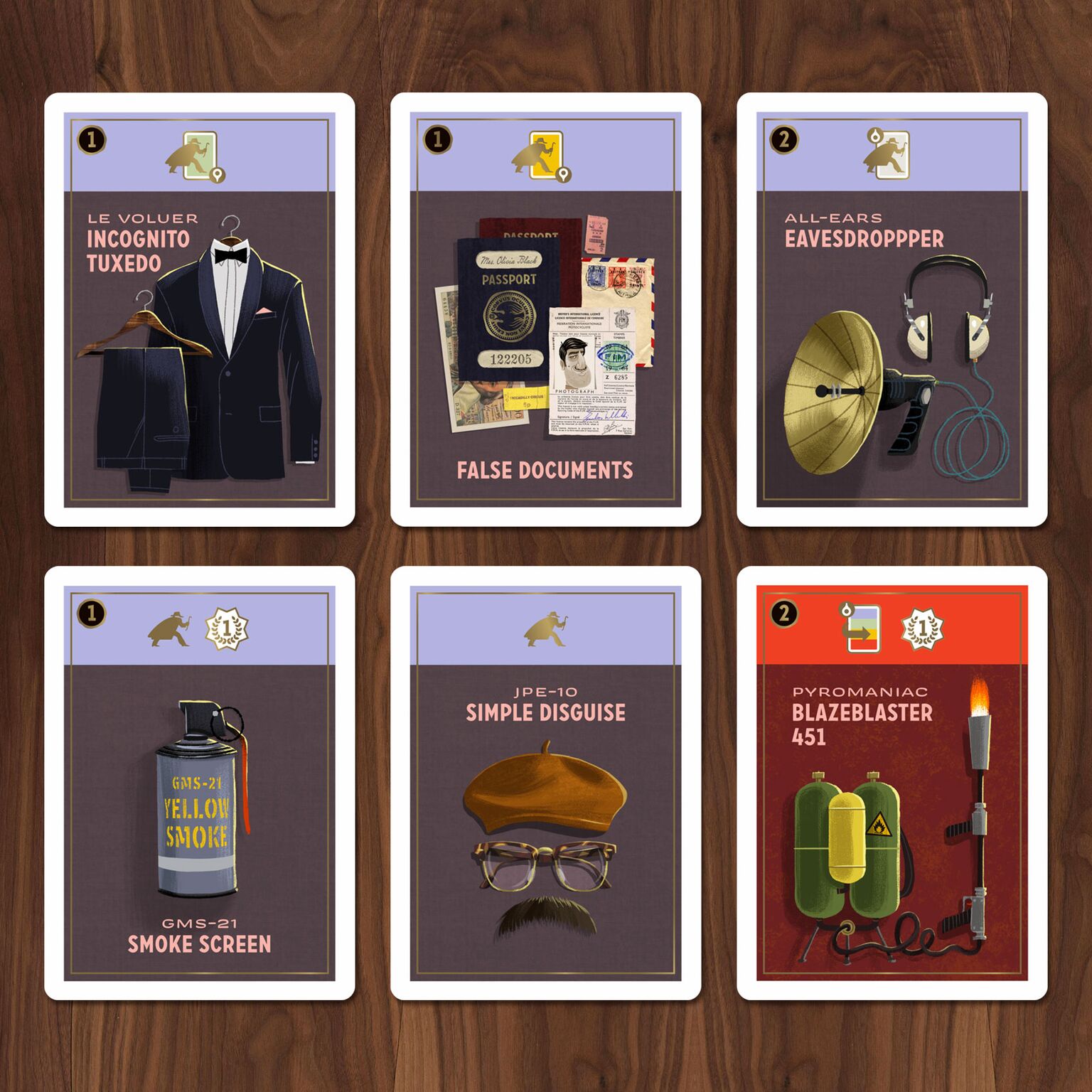
Besides the art, one of the more notable changes we made was on the Gear cards. In Caper, you and your opponent are trying to draft the right team of thieves and equip them with gear. The original game had action cards instead of gear, and some of the cards didn’t feel cohesive as a set. The original action cards also pictured thieves, so it made it difficult to distinguish thief character cards from the actions cards. We thought it would be more fun to explore the tools of the thief trade, which imply action by the nature of their purpose, and we could make the gear cards distinct from the thief cards.
What are the pros/cons of designing a game that relies heavily on iconography and color instead of text?
From a player’s perspective, the cons are that you need to familiarize yourself with the icons and color-coding before you can dive deep into strategy. From a designer and illustrator’s perspective, it’s a lot more work: you have to develop a coherent system that works for many different actions and you have to pick colors that are distinct so that players can tell them apart. Color-coding is easier if you’re okay with everything looking like a rainbow, but when you want the game to retain a unique color story, it’s a bit more difficult. Keymaster took the additional step of including a quick reference guide in case a player isn’t quite sure how an action is resolved based on the icon alone.
When the icons and color-coding are well-executed, it enables the game to have some unique mechanics. Gameplay becomes quick and intuitive, allowing the players to dive deep into strategy. Because the game isn’t reliant upon text, you and your opponent could play Caper even if you don’t speak the same language.
What did the creative process look like for this project (maybe through the lens of character design development)?
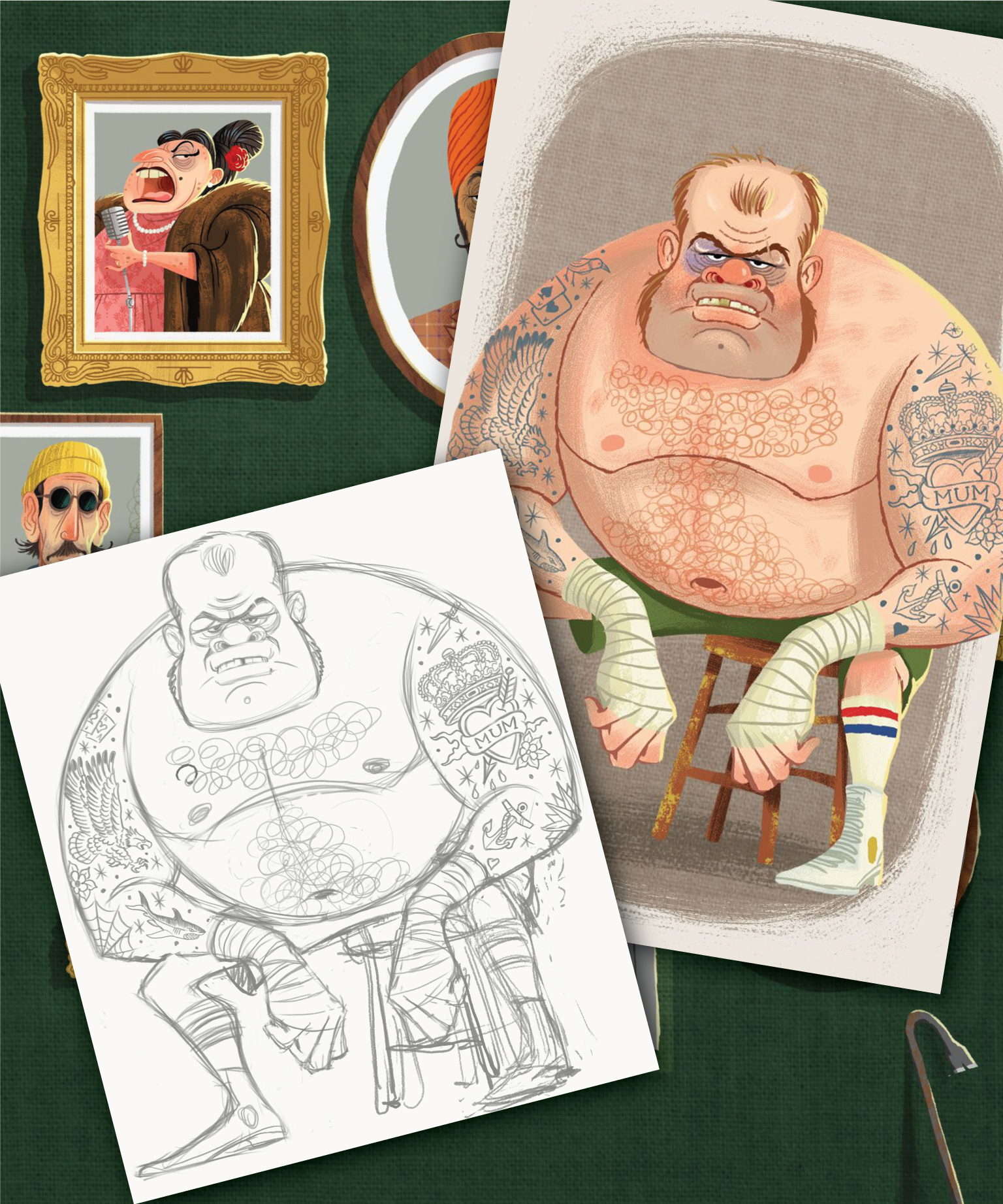
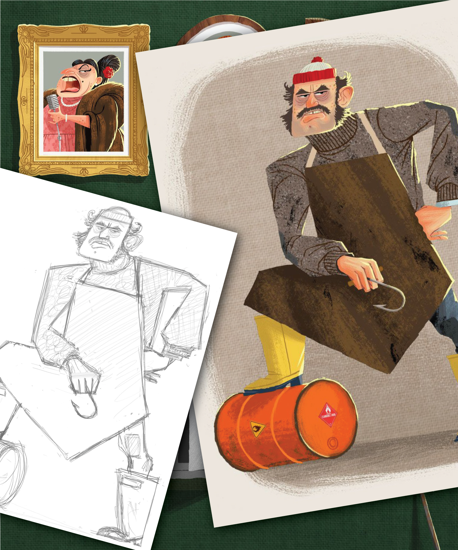
For most of my projects — whether I’m illustrating a board game or a beer label — I want it to feel like there’s fully-developed story lurking behind the images. Well-themed games also have the ability to transport you, so setting becomes really important. In Caper, players have the option of pulling off heists in Paris, Rome or London — all fascinating locations, but if we shift the setting to an exciting moment in history, it becomes more immersive. I love watching all those great 60s heist and romantic thrillers set in Europe, such as How to Steal a Million, The Thomas Crown Affair, The Italian Job, The Pink Panther, To Catch a Thief, and Charade. Those films are full of charm, glamour, romance, intrigue, and a cast of colorful characters — a perfect setting for Caper. When I was pitching this idea to Mattox at Keymaster, the best way I could describe it was “What if Wes Anderson directed a Pixar-animated heist film set in 1960-something Europe.” Who wouldn’t want to see that?
Once I had that as a guiding principle, all other design choices fall into place and my creative process looks like any other. I design and illustrate out all the major game components and box, while Keymaster handles the rule book and product descriptions.
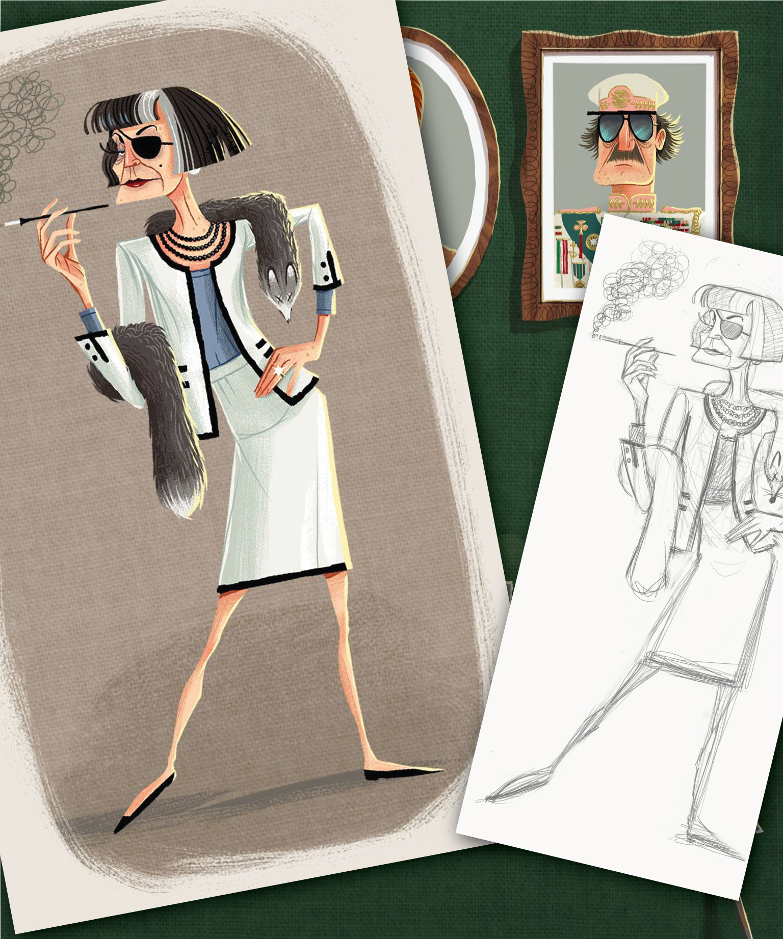
You mention the Stealth Suit is a nod to Cary Grant’s cat burglar character in Hitchcock’s “To Catch a Thief”. Are there other film references/easter eggs in the game? Do you have a favorite?
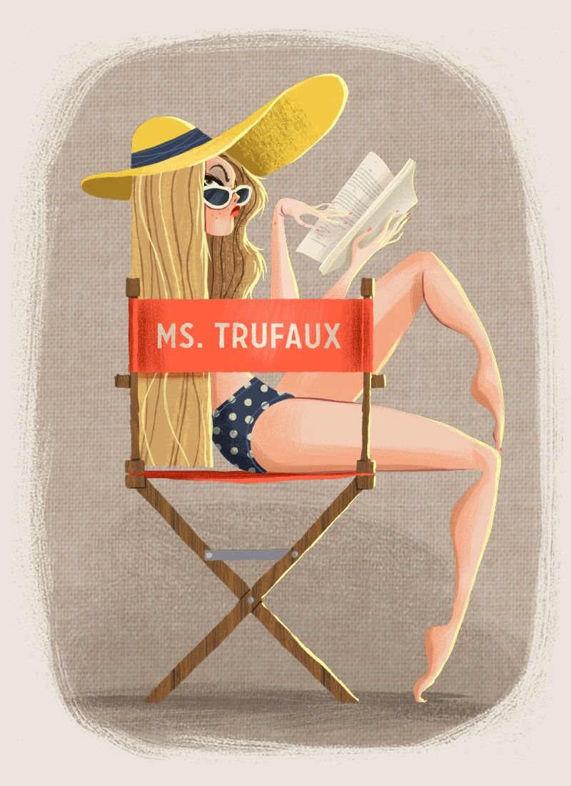
Yes, there are quite a few easter eggs. My favorite is on the Actress’ thief card. Her set chair displays her name “Ms. Trufaux.” Not only is it an oxymoron — literally “True Fake” — but it’s also a reference to the French film director François Truffaut. Here’s another one: on the False Document gear card, I used Steve McQueen’s actual international driver’s license but with The Driver’s face in place of Steve’s photo.
What do you hope people notice about the game when they unbox it for the first time?
I hope they think the whole package feels fresh and exciting. Ultimately, I want (people to) notice that all the little details are our way of showing that we care about the people who play our games.
In your last game (Campy Creatures), you were really intentional in producing various supplemental products to make it more immersive. do you have anything like that planned for Caper?
Campy Creatures has a built-in audience due to the classic horror film fan base, making supplemental products a no-brainer. Caper is world unto itself, so we want people to fall in love with the game first.
That said, Keymaster will be offering an add-on cast-metal version of the game’s currency, which are called “Scoundrels.”
I’m also working on some Caper enamel pins at GenCon featuring the seal of the Society of Scoundrels, the secret organization for Caper’s thieves. The seal features a crow — a bird that’s well known for its larceny — holding a precious stone in its mouth with the latin inscription “CORVUS OCULUM CORVI NON ERUIT” which literally means “A crow will not pull out the eye of another crow”. It’s basically another way to say “honor amongst thieves.”
What’s next on the agenda for you? What can we expect from Emrich Office in the not-too-distant future?
We’re working with Keymaster Games on expansions and new games in the Campy Creatures MCU. When we’re not creating brand art for games, we’re still creating the design and illustrating the packaging for several craft breweries. This marks our 5th year in business as Emrich Office, so we’ve teamed up with our friends at Bottle Logic Brewing to create a very special beer to celebrate. Bottle Logic’s beers are super collectable, but I’m working hard to make sure it’s represents the culmination of all my work over the last 5 years in the craft beer industry. When the beer is ready to be released this fall, we will be raffling a portion of bottles off to the public with the proceeds going to arts education.

Mof1 Podcast
Master of One
Master of One is a producer-centric outlet focused on the latest in creative pop culture. Every week they interview a creative giant and drop their hard fought-for dollars on cool stuff just so they can share it with you. You're gonna learn something new and want to spend money... and you're gonna love every minute of it.